In this article, we going to learn how to create simple interactive dashboards with Python Dash frameworks.
Whether data scientist or programmer, sometimes you would need simple dashboards to show your work efficiently, so I created this beginner tutorial.
Dash framework could be hard for beginners if you are new to data science or Python programming, you can use Streamlit as an alternative.
What is Dash Framework?
Dash framework provides creating interactive data visualization dashboards without Js, Html, and CSS. With dash, you can create dashboards for use on the web.
Dash is an open-source framework so everyone uses and develops this framework. Dash dashboards are visible on the internet browser.
Parts of Dash Dashboards
Dash applications occur of 2 things, there are layout and callbacks. These are both create interactive dashboards.
Layout describes the look and feels of the app, it defines the elements such as graphs, dropdowns, etc, and the placement, size, color, etc of these elements.
Note: Dash contains Dash HTML components, this component allows access to HTML properties as paragraphs, headers, images, etc.
Callbacks are used in dash applications to add interactivity. These are that allow us to define the activity that occurs when we click a button or a dropdown menu.
Installing Libraries
Now, we are going to install Dash and Plotly library to use creating dashboards. Plotly is required with the aim of creating graphics.
Additionally, we are going to install dash components for more features of our dashboards.
pip install dash
pip install plotly
pip install dash-html-components
pip install dash-core-components
Now, we are ready for adding these package to our code. Dash core components ensure sliders, dropdowns, etc.
import dash
import dash_html_components as html
import dash_core_components as dcc
import plotly.graph_objects as go
import plotly.express as px
When we start creating the dashboards, we will refer to the libraries here one by one. Let’s go get our data now.
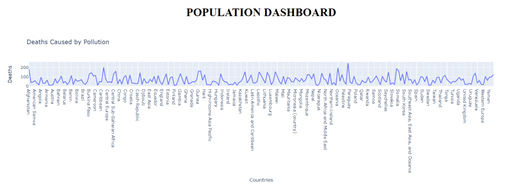
We are going to use the Deaths Caused By Pollution dataset. This dataset offers pollution deaths in countries. Click here to access the dataset on Kaggle.
Creating Dashboard Layout
We finished all requirements for starting. In this chapter, we going to learn how to create a layout in the Dash framework.
Before we started, we needed to fine-tune the dataset. We’re cleaning up missing data, tidying up column names, and removing some irrelevant columns.
This dataset anymore ready with the aim of creating a dashboard layout. Firstly we need a line graph for sequence country by deaths.
We are going to use graph_object and HTML components. We’ll create plots with the graph_object component and we gonna add style with HTML components.
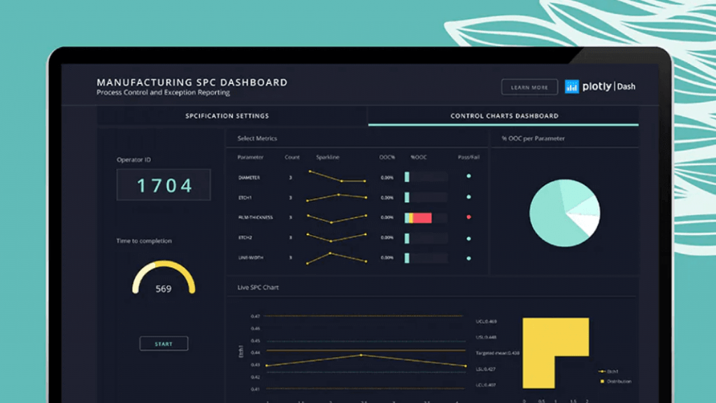
when you complete your code, your first layout should look like the image below. Now, we are ready to split code for explaining step by step.
In this article, instead of taking a deep look at the HTML component, we will look at a few important tags.
1 – Important HTML Compenets
In this section, we are going to look at important and most uses components in HTML for creating a dashboard.
# Div Tag
html.Div(id , children)
The div tag is an HTML code container, it wraps the H2 effect in the previous layout, that is, it holds the graphic and the title.
The id parameter is the special identifier of the div, the children parameter contains children variables.
# H1-H2-H3-H4 Tags
html.H1(id, children, style)
These tags are used to create headings. From H1 to H5, the size of the headings is getting smaller. It can take children with the Children parameter.
The style parameter can be used to further customize the H effects, this parameter is used to apply styles such as centering text, color.
# P Tag
html.p(id,children,style)
You can write paragraphs with the P tag. you added the title, created your graphic, it can be useful if you want to give more detail.
All its parameters work the same as other components. Write your text in children, then use the style parameter for fine-tuning.
We have many more HTML tags, but learning these tags is enough as this article is just a starting point.
2 – Plotly Graphs and Adding These Graphics in Layout
In this subsection, we are going to look at graph functions in plotly, and how to we could add these plots in layout.
Firstly, we use graph_objects to create graphs. After creating, we need to add this graph in a layout, that’s when dash_core_components comes to our aid.
# Plotly Graph Objects
import plotly.graph_objects as go

# Graph Functions
go.Figure([go.Scatter(x,y)])
go.Figure([go.Bar(x,y)])
go.Figure([go.Histogram(x,bin)])
With the help of these functions, you can create the type of graph you want, after creating it, we need to make it visible.
For this, we add the graphic to the layout, we can add the graphic to the layout with the Graph function that DCC offers us.
dcc.Graph(id = "scatterPlot", figure = populationBar())If we examine the code above, we define a graph with the custom name scatterPlot, the Figure parameter must contain the graph.
Making Interactive Dashboard (Drop-Down)
In this chapter, we are going to add interactive properties to our layout. We’ll learn how to setting graphs according to the drop-down menu.
In this section, we are going to make a chart comparing countries’ annual deaths from air pollution (For example, the number of people who lost their lives in 5 years.)
Firstly, we are going to add a drop-down menu for setting the country in the graph. Let’s start with creating the drop-down menu.
You can create a dropdown menu using dcc, it is also possible to add other countries to this menu.
2 values are added to the dictionary, the first one is the label key, which determines the text that the user will see, second value key determines what value it will return.
This function takes the input values from the drop-down menu and adds them to the graph as output.
Now the layout has been changed a little more, the year and death data of the country selected from the drop-down menu are presented in the graph.
Now let’s combine all the code and continue the examinations on the main code.
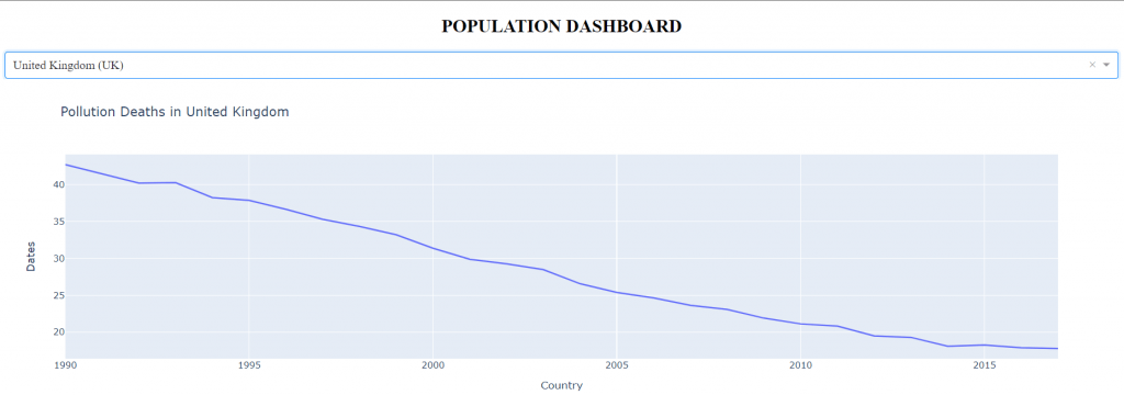
We have successfully completed our first interactive indicator, now we can see the citizens of different countries who died from air pollution over the years.
In general, the code works like this: get the data from the dropdown menu, search the received data in the dataset, process the data to the graph and update the layout.
This article was created to show the basics for those who want to learn about Dash. You can refer to the Dash Documents for more information.
Hello. And Bye.
Hello from Happykiddi.