
Graphics are mostly created on the 2D plane, but in some cases, we need 3D graphs. In this article, we will look at how to create 3D graphs with Python matplotlib.
Those who are already familiar with data visualization will easily understand the structure and logic of 3D graphs, but if you don’t have a background, read this article.
Introduction to 3D Graphs
We have 3D graphics to fill the parts where 2D graphics are not enough, all kinds of graphics available in matplotlib also have 3D versions.
3D graphics may seem more complex at first than 2D graphics, but once you learn the logic, both types of graphics are exactly the same, the only difference is height (z axis).
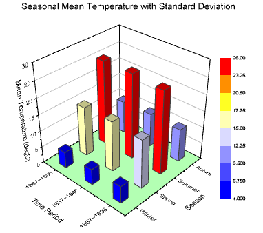
Let’s examine the graph above, the variables in the graph: time period, average temp, and seasons. We cannot use 2D graphics here, if we do, 1 variable will be idle.
In cases where we have 3 such variables, 3D graphics are used when we want to visualize the height. Now let’s get to practice.
Creating 3D Figure
To visualize the data, we need to create a 3D container, we will follow the same steps as creating a 2D figure, the only difference is to specify that we will apply a 3D graphic to the projection parameter.
import matplotlib.pyplot as plt

ax = plt.axes(projection = "3d")
Perspective can be a problem for beginners. To prevent this, let’s examine how a single piece of data stands on the graph before big data.
fig = plt.figure(figsize = (4,4))

# Create point (1,3,4) on figure
ax.scatter(1 , 3 , 2)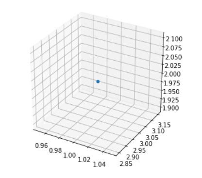
There are only x and y-axis on the 2D graph, so we have horizontal and vertical but here, we have z-axis, so we can assign a value to it separately and place the point accordingly.
3D Line Graphs
We learned the basics of 3-dimensional graphics, now we’ll learn graph types in 3D. We will examine line, bar, and finally, scatter charts.
# Required library
import numpy as np

# Resizing Figure
fig = plt.figure(figsize=(8,6))

# Creating Data
x = np.linspace(0 , 20 , 100)
y = np.sin(x)
z = np.cos(x)

# 3D Graphic
ax = plt.axes(projection = "3d")

# 3D line plot
ax.plot3D(x, y, z)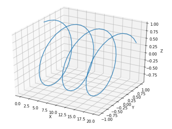
3D Bar Graphs
Usually, 3D graphs are created in the type of bar graph, 3-variable values are often well visualized with bar graphs.
import matplotlib.pyplot as plt
import numpy as np

fig = plt.figure()
ax = plt.axes(projection="3d")

x = range(10)
y = [5,4,1,2,6,8,7,10,9,4]
z = np.zeros(10)

dx = np.ones(10)
dy = np.ones(10)
dz = range(10)

ax.bar3d(x,y,z,dx,dy,dz)

ax.set_xlabel("x axis")
ax.set_ylabel("y axis")
ax.set_zlabel("z axis")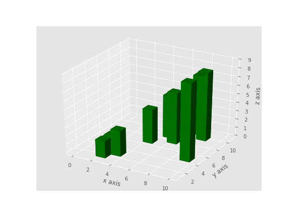
We’ll stay long on this subject because learning concepts such as delta x, delta y, delta z is the real trick here. Let’s start examining the graph from different perspectives and experiment with the code.
Fully Understanding 3D Bar Graphs
In this sub-title, I will try to explain exactly how 3D bar graphs work. After this chapter, I hope you will fully understand 3D bar graphs.
Delta x, Delta y, and Delta z increase values are shown here. We said that the bar should not increase on the x and y axes, but we wanted it to increase by ones on the z-axis, if we rotate the perspective in x and y ways, we can see the increase in the z-axis.
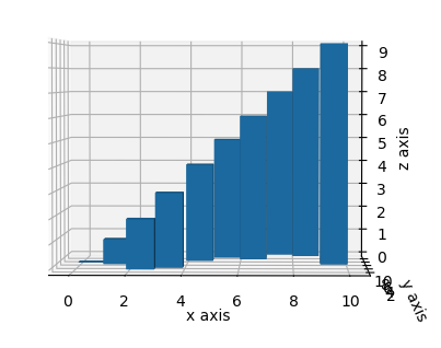
While no increase is observed in the x and y axes, an increase of 1 by 1 is observed in the z-axis. Now let’s explain the X, Y, and Z values.
X and Y values already vary on the graph. It can be seen easily with the first graph, but what happens when you increase the Z-axis, let’s see with the graph below.
# The graph is exactly the same as the code above, only the data on the z-axis last value has been increased 2.

z = [1,1,1,1,1,1,1,1,1,3]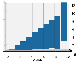
As you can see, the last bar started from 3 instead of 0. As you change the data on the z-axis, each bar will be affected and have height.
I hope I have explained the 3D bar graph logic well, now let’s move on to 3D scatter graphs.
3D Scatter Graphs
2D Scatter plots are exactly the same, they don’t require any different parameters, just specify x – y and z values.
# For Generating Random Number
import random as rm
import matplotlib.pyplot as plt

ax = plt.axes(projection='3d')

#Create 99 random numbers from 0 to 100
x = rm.sample(range(0, 100), 99)
y = rm.sample(range(0, 100), 99)
z = rm.sample(range(0, 100), 99)

ax.scatter(x , y , z)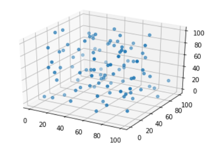
As you can see, the data in the 2D scatter plot are given height only, they are the same in structure, thanks a lot for reading!