
In this section, we will see the topics we covered in the first part more comprehensively and learn the new features we can use.
If you haven’t read the first part, you can reach the first part here.
In this section, we will learn about histogram, bar, and scatter graphics. We will comprehend which graphic we should use for which job and we will expand on the concepts we learned in the previous lesson.
Bar Graphics In Python
Apart from the line chart, there are chart types where you can visualize your data. In this tutorial, we will learn the other most used chart types along with the draw chart.
A bar chart allows comparing data across different categories. It is very convenient when you want to measure changes over a period of time.
import matplotlib.pyplot as plt
plt.figure()

x = ["Label1", "Label2" , "Label3" , "Label4"]
y = [200, 100 , 400 , 300]

plt.bar(x , y)
plt.show()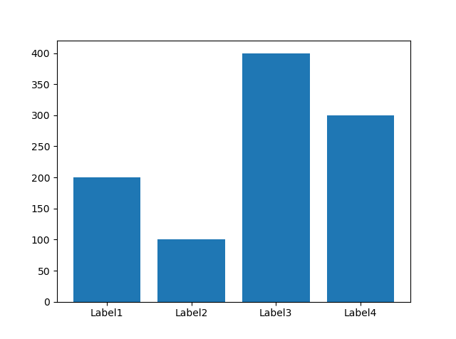
You can also create this graph horizontally, just use the barh function with the same operations.
We have a few parameters to customize, now let’s customize the chart using them.
import matplotlib.pyplot as plt
plt.figure()

x = ["Label1", "Label2" , "Label3" , "Label4"]
y = [200, 100 , 400 , 300]

plt.bar(x,
        y,
        color = "black",
        border = "white",
        width = 0.1,
        linewidth = 2)

plt.show()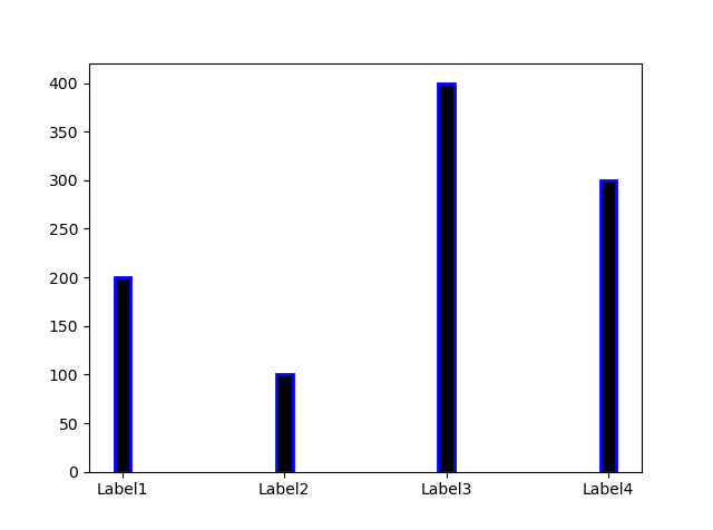
color = change filling color
border = change border color
linewidth = change border thickness
width = change filling width
Bar Graphic In R
x <- c("X" , "Y" , "Z" , "K")
y <- c(100 , 200 , 50 , 300)

barplot(x , name.arg = y)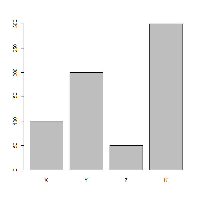
Do not forget to enter the name.arg parameter before adding the labels. Now let’s customize the chart.
y <- c("X" , "Y" , "Z" , "K" , "L" , "O")
x <- c(100 , 200 , 50 , 300 , 200 , 40)

barplot(x , names.arg = y , border = "pink" , col = "black")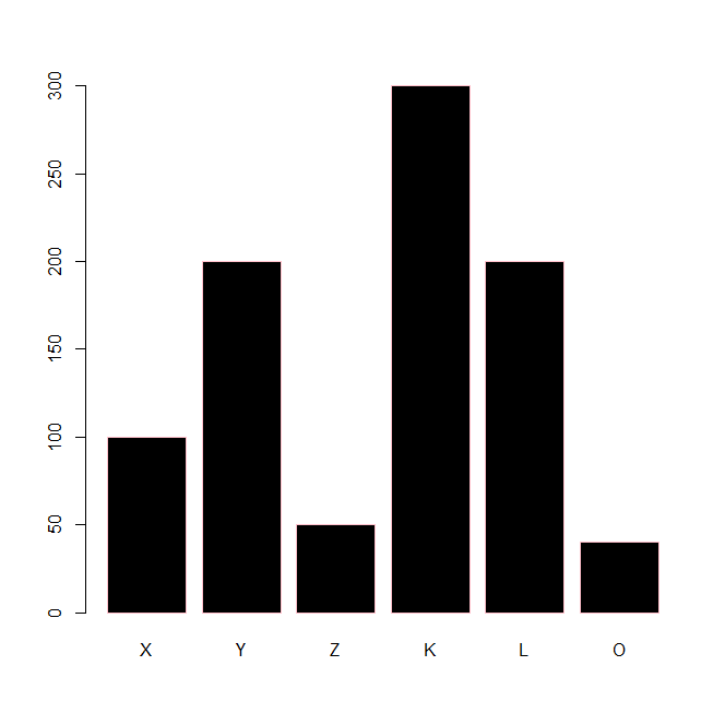
Histogram Graphics In Python
The histogram is the classification of the values in a data group and the display of this structured classification with a specially created column chart.
The columns in the column chart created in the histogram represent a group of data, not a single data as in the normal column chart, so they are named with a range when naming them.
import matplotlib.pyplot as plt
import numpy as np

plt.figure()
# Create Random 10000 Number
values = np.random.randn(10000)

# Create Histogram With Values
plt.hist(values , bins = 20)

plt.show()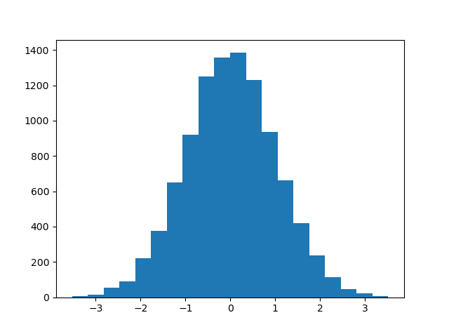
The graph created may look slightly different from the line graph, the main reason for this is that we use bin parameters instead of assigning a value to the x-axis.
The bin determines the range of numbers for the x-axis The main purpose of a histogram is to sort the same data.
Let’s now learn about the parameters that can be used for this graph and see how to improve the readability of a histogram.
import matplotlib.pyplot as plt
import numpy as np

plt.figure()
# Create Random 10000 Number
values = np.random.randn(10000)

# Create Histogram With Values
plt.hist(values,
         bins = 20,
         facecolor = "green",
         edgecolor = "black")

plt.show()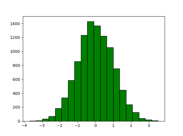
We have seen these two concepts in the previous lesson, facecolor is used to change the color of the bar’s fill, while edgecolor is used to change the color of the borders.
Histogram Graphic In R
Creating a histogram on R is almost the same as in Python. All the rules we mentioned above apply to R as well.
# Create 10000 Random Number
x <- rnorm(10000)

# Create Histogram With x
hist(x , 50)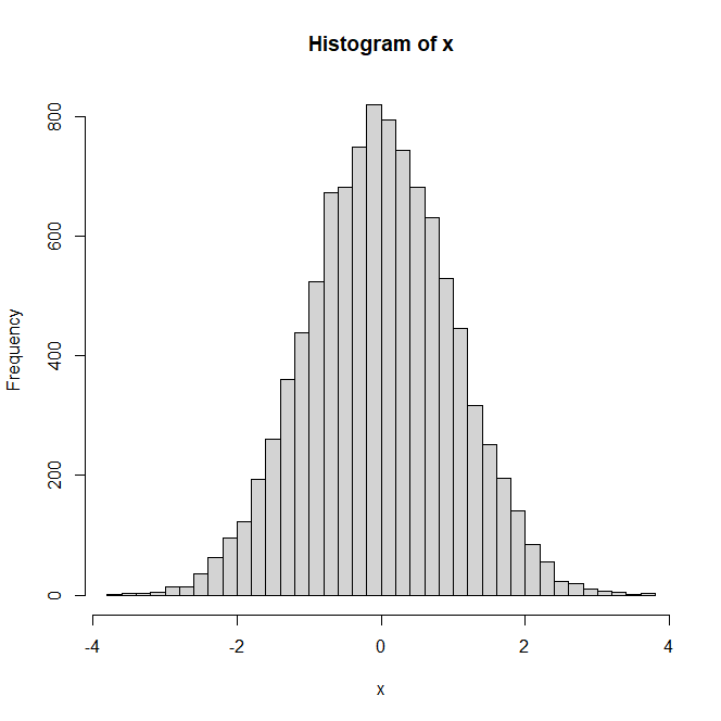
Edges come ready by default in R, so when you create it this way, you get a more legible graphic compared to the histogram in Python.
Of course, R offers you features and parameters to customize the histogram. You can use concepts such as labels, I do not use them again because we used them in previous article.
# Create 10000 Random Number
x <- rnorm(10000)

# Create Histogram With x
hist(x , 50 , border = "red" , col = "black")

# border = border color
# col = filling color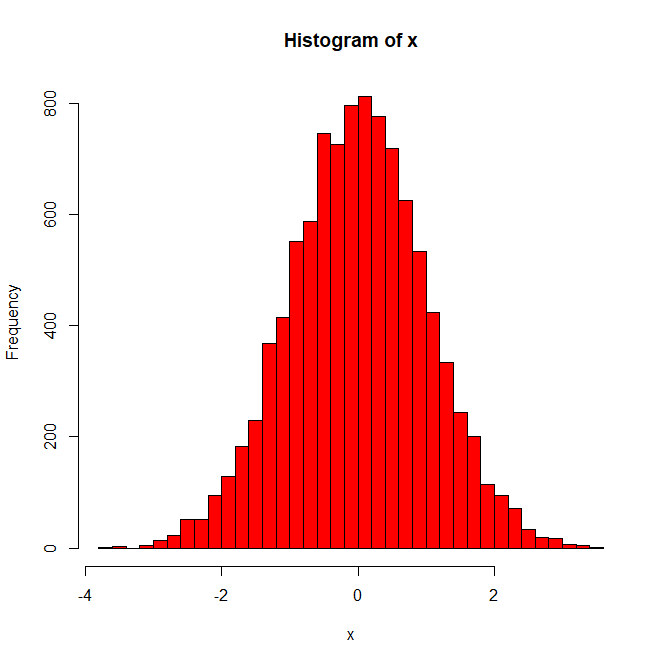
Scatter Graphic In Python & R
The Scatter Chart uses a collection of points placed using Cartesian coordinates to display the values of two variables.
By displaying one variable on each axis, it can be determined whether there is a relationship or correlation between two variables.
import matplotlib.pyplot as plt
import numpy as np

plt.figure()

x = [np.random.randn(100)]
y = [np.random.randn(100)]

plt.scatter(x, y)

plt.show()
We have prepared a scatter chart with randomly generated 100 numbers and we can easily handle it on R The scatter chart, like other charts, is sufficient to get data for the x and y axis.
x <- c(1 , 2 , 3 , 4, 5)
y <- c(10 , 20 , 30 , 40 , 50)

plot(x,y)
In the previous lesson we mentioned that the plot function creates scatter by default, you can easily create scatters with the plot function without using the style parameter.
import matplotlib.pyplot as plt
import numpy as np

plt.figure()

# X Axis
x = np.array([1 , 3 , 4 , 2 , 5 , 6 , 3])
# Y Axis
y = np.array([5 , 10 , 15 , 20 , 25 , 30 , 35])
# Change Color By These Ranges
color = np.array([10 , 20 , 30 , 40 , 50 , 60 , 70])

plt.scatter(x, y , c = color , cmap='viridis')

plt.colorbar()
plt.show()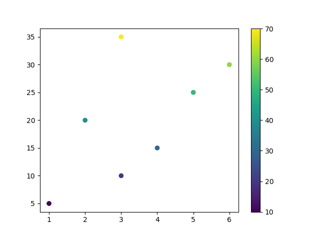
We have created a slightly different structure compared to the previous graphic designs. One of the designs that best summarizes the distribution of data is to use colorbar.
You can use other markers instead of using a circle marker, so use the marker pareneter from the previous lesson.
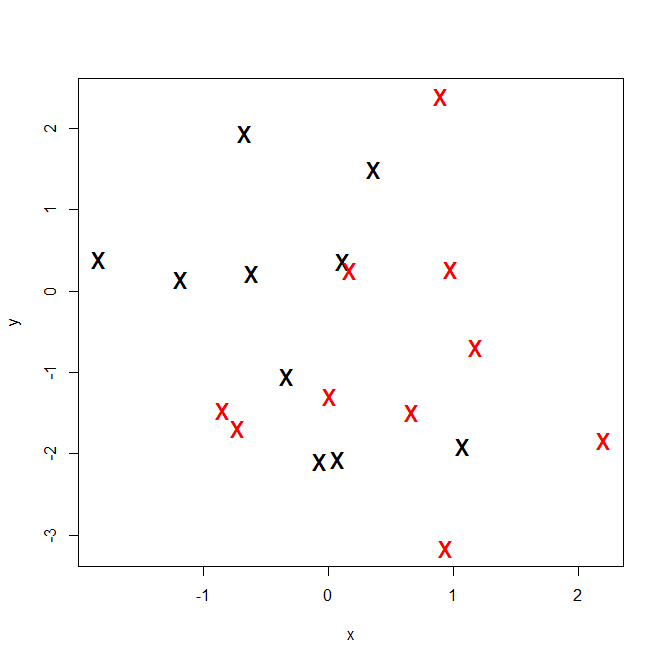
x <- rnorm(20)
y <- rnorm(20)

plot(x,
     y,
     col = c("black" , "red"),
     pch = "x",
     cex = 2)
Note: You can separate the colors of the markers by assigning a vector value to the color parameter. pch = It is a parameter used to change markers. At the end of this article, I will give all markers and styles as a table. cex = the number indicating the amount of text and symbols that should be scaled by default.
Markers And Line Styles List
Examine all the values of these two parameters that we mostly use as a list, and we will use these more in the following sections.
Python Marker List
"." = point marker
"," = pixel marker
"o" = circle marker
"^" = triangle marker
"8" = octogon marker
"x" = x marker
"D" = diamond marker
"P" = plus marker
"*" = star marker
Python Line Style List
"-" = solid line style
"--" = dashed line style
"-." = dash-dot line style
":" = dotted line style
R Marker List
- pch = 0, square
- pch = 1, circle
- pch = 2, triangle point up
- pch = 3, plus
- pch = 4, cross
- pch = 5, diamond
- pch = 6, triangle point down
- pch = 7, square cross
- pch = 8, star
- pch = 9, diamond plus
- pch = 10, circle plus
- pch = 11, triangles up and down
- pch = 12, square plus
- pch = 13, circle cross
- pch = 14, square and triangle down
- pch = 15, filled square
- pch = 16, filled circle
- pch = 17, filled triangle point-up
- pch = 18, filled diamond
- pch = 19, solid circle
- pch = 20, bullet (smaller circle)
- pch = 21, filled circle blue
- pch = 22, filled square blue
- pch = 23, filled diamond blue
- pch = 24, filled triangle point-up blue
- pch = 25, filled triangle point down blue
R Line Style List
- lty = “blank”, empty line
- lty = “solid”, default line
- lty = “dashed”, dashed line
- lty = “dotted”, dotted line
- lty = “dotdash”, dotdash line
- lty = “longdash”, longdash line
- lty = “twodash”, twodash line