Every learned knowledge can be perfected by re-training. In this section, we will repeat all the information we learned in the previous sections on the projects.
We will also learn about problems such as how we work on data in real life and finding out which visualization technique is more appropriate.
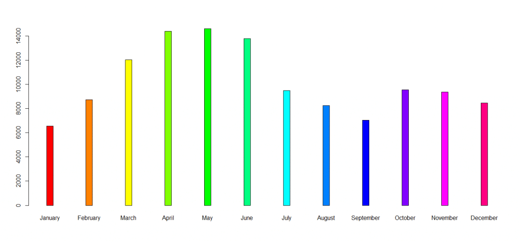
Car Selling Graphic By Month
For this example, the most appropriate graphic among the graphics we have learned so far will be the bar chart.
A bar chart is very useful for dividing the x-axis by 12 months and sorting data from small to large.
"Month","Sales"

"January",6550
"February",8728
"March",12026
"April",14395
"May",14587
"June",13791
"July",9498
"August",8251
"September",7049
"October",9545
"November",9364
"December",8456
import pandas as pd
import matplotlib.pyplot as plt
# Read Dataset For Getting Data
dataset = pd.read_csv("dataset.csv")
# Get All Row And Get First Column
xAxis = dataset.iloc[:, 0]
# Get All Row And Get Second Column
yAxis = dataset.iloc[:, 1]
# Graphic Size
plt.figure(figsize = [15,15])
plt.bar(xAxis,
yAxis,
color=[
"red", "green", "black",
"blue", "orange", "pink",
"gold", "brown", "gray",
"purple"
],
width = 0.1,
linewidth = 0.5,
edgecolor = "black")
plt.show()
dataset = read_csv("dataset.csv")

# Get All Row And Get First Column
xAxis = dataset[,1]

# Get All Row And Get Second Column
yAxis = dataset[,2]

barplot(yAxis,
         names.arg = xAxis,
         col = rainbow(12),
         space = 5
        )
We did not see the two parameters we used here in the previous compilation. Let’s explain these two parameters and then examine the graph.
rainbow function = Returns a different color as much as the value entered into

space = It is used to increase or decrease the gap between each bar.
Title, xlabel, and ylabel like parameters can be added to these graphics, only the basic programming has been done here, you can use the information in the previous lessons.
Net Profit Chart Of The Two Companies
Our main goal in this table is to compare the monthly net profits of two different companies. In this example, we will visualize the net profits of companies to compare their productivity.
You can use a scatter or line charts when comparing 2 different data sets, we will use a line chart in this section.
"Month","Profit1","Profit2"
1,      12.000,    32.340
2,      23.531,    26.451
3,      18.200,    24.189
4,      8.391 ,    35.942
5,      32.123,    29.163
6,      52.935,    42.143
7,      43.216,    18.020
8,      61.111,    28.033
9,      52.168,    35.125
10,     45.128,    48.234
11,     72.893,    32.457
12,     71.256,    52.345

# This dataset hasn't real company data, it's created with random values
We have previously worked on 1 data set with line charts only. In this section, I will give a little hint to be difficult because we will work with 2 data sets.
When you want to add a new set on the chart, it is useful to use the plt.plot function once again before the plt.show () function.
You can create a new graphic line on R with the lines function, we will see these two functions again on the example.
import matplotlib.pyplot as plt
import pandas as pd

dataset = pd.read_csv("dataset.csv")

xAxis = dataset.iloc[: , 0]
yAxis = dataset.iloc[: , 1]
SecondCompany = dataset.iloc[: , 2]

plt.figure()

plt.plot(xAxis , yAxis , color = "red")
plt.plot(SecondCompany , color = "black")

# Design
plt.title("Two Company Profit")
plt.xlabel("Month")
plt.ylabel("Net Profit")

# Show Line Name In Top Bar
plt.legend(["First Company" , "Second Company"])
plt.show()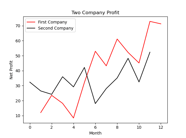
dataset <- read.csv("DatasetName.csv")

xAxis <- dataset[,1]
yAxis <- dataset[,2]
SecondCompany <- dataset[,3]

plot(xAxis,
     yAxis,
     type = "l",
     col = "red",
     xlab = "Month",
     ylab = "Net Profit",
     main = "Two Company Profit")

lines(SecondCompany,
      type = "l",
      col = "green")

legend("topleft",
       c("yAxis" , "SecondCompany"),
       fill=c("red","green"))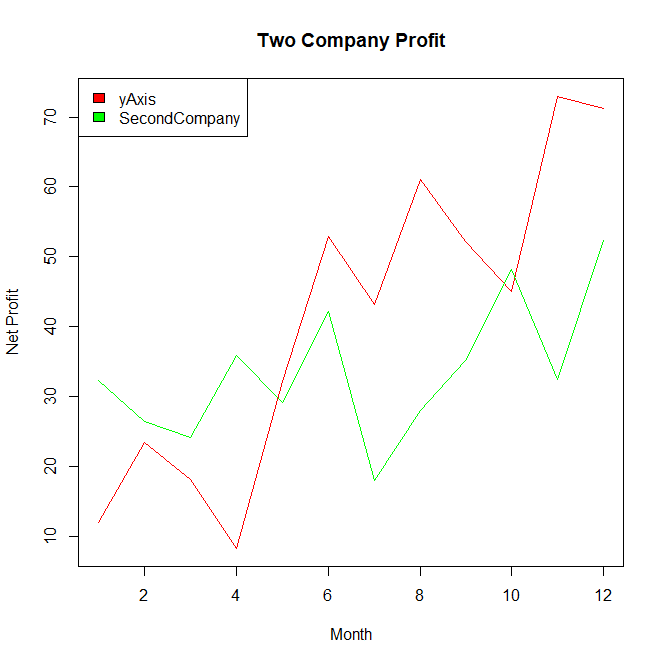
Both programming languages offer different functions and parameters for the same job, although the output from Python is more vivid.
If you want to create impressive line graphics, Python can be a good choice for you. You can create the charts in both tools according to your personal preference.
Fruit Sales By Temperature
Our new topic chosen to repeat the distribution chart will be the change of fruit sales by temperature.
It is a fact that temperatures change the way we eat. There are temperature values and 2 different fruit types in this data set.
Temperatures are moving from cold to hot, now we will visualize the sales of these 2 different fruits with a scatter chart.
"Temperature","Banana","Kiwi"
0.00         ,32      ,634
7.00         ,24      ,542
13.0         ,68      ,478
15.0         ,120     ,355
21.0         ,283     ,86
27.0         ,392     ,52
31.0         ,562     ,13
An important warning, this dataset is prepared for training. Don’t forget to save the data in csv file format.
import matplotlib.pyplot as plt
import pandas as pd

dataset = pd.read_csv("dataset.csv")

xAxis = dataset.iloc[: , 0]
Banana = dataset.iloc[: , 1]
Kiwi = dataset.iloc[: , 2]

plt.figure()

plt.scatter(xAxis , Banana , color = "gold")
plt.scatter(xAxis , Kiwi , color = "green")

plt.title("Fruit Sales By Temperature")
plt.xlabel("Temperature")
plt.ylabel("Sales")

plt.legend(["Banana" , "Kiwi"])
plt.show() 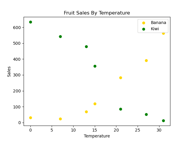
dataset <- read.csv("dataset.csv")

xAxis <- dataset[,1]
Banana <- dataset[,2]
Kiwi = dataset[,3]

plot(xAxis,
     Banana,
     col = "gold",
     xlab = "Temperature",
     ylab = "Sales",
     main = "Fruit Sales By Temperature",
     type = "l")

lines(xAxis,
      Kiwi,
      col = "green",
      xlab = "Temperature",
      ylab = "Sales",
      main = "Fruit Sales By Temperature")

legend("topright",
       c("Banana" , "Kiwi"),
       fill=c("gold","green"))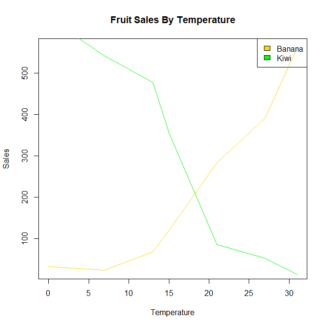
You can prepare this graphic in the form of a bar graph instead of a scatter or a line graph, the bar graph is more suitable for this job, but since the main purpose here is to repeat what we learned, so we used scatters.